
Video From Photographs: Turning a Folder of Stills Into One Film
A video from photographs lives or dies on three numbers — how many photos you include, how long each one holds, and where the music lands. Get those right and the transitions stop mattering.
On this page
# Video From Photographs: Turning a Folder of Stills Into One Film
Making a video from photographs is not an editing problem. It is a counting problem. Almost every slideshow that feels slow, boring, or abruptly cut has the same root cause: the author chose the number of photos by how many they had rather than by how long the video needed to be. Fix the arithmetic first and half the craft disappears.
The arithmetic is three numbers: how long the finished video runs, how many photographs are in it, and how long each one holds. They are not independent. Pick any two and the third is decided. Most people pick the wrong two — they pick the photos and the length, then let the hold time fall wherever it lands, which is how you get a thirty-second video where each image flashes past in under a second.
The three numbers
A hold time under about 1.2 seconds reads as a flicker rather than a shot: the eye registers that something changed but not what it was. A hold time over about 4 seconds on a still image starts to feel like the video has stopped, unless the image is doing something — a slow push in, a pan across a wide frame, or a caption that arrives after the first beat.
So the useful working range is roughly 1.5 to 3.5 seconds per photograph, and the number of photos you need is just the runtime divided by the hold time.
| Finished length | Photos at 1.5 s each | Photos at 2.5 s each | Photos at 3.5 s each | Best for |
|---|---|---|---|---|
| 15 s | 10 | 6 | 4 | A story post, a Reel, a single-moment recap |
| 30 s | 20 | 12 | 9 | A birthday, a launch, a short trip recap |
| 60 s | 40 | 24 | 17 | A wedding segment, a year in review |
| 90 s | 60 | 36 | 26 | An event film, a memorial piece |
| 3 min | 120 | 72 | 51 | A full album, a documentary insert |
Read the table as a budget, not a target. If you have 200 photographs and want a 30-second video, you are not making a slideshow of 200 photographs — you are choosing 12. The selection is the work. Everything after it is mechanical.
Ordering a folder of stills
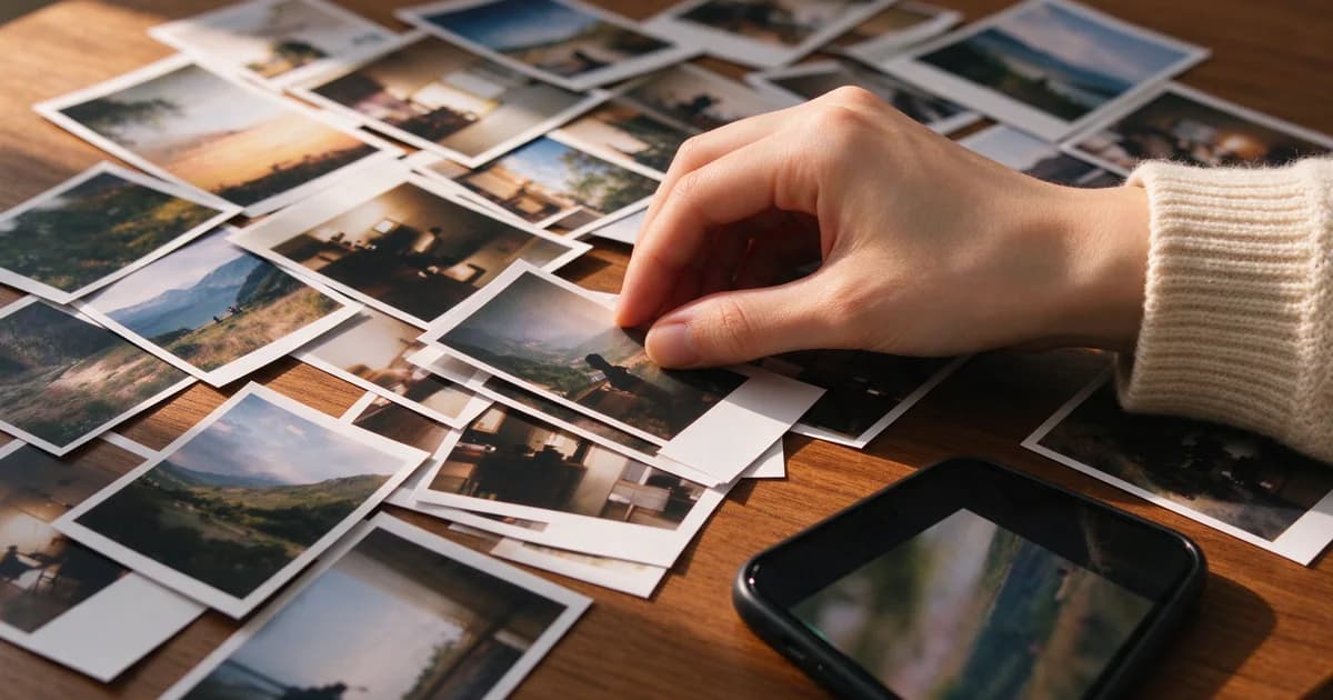
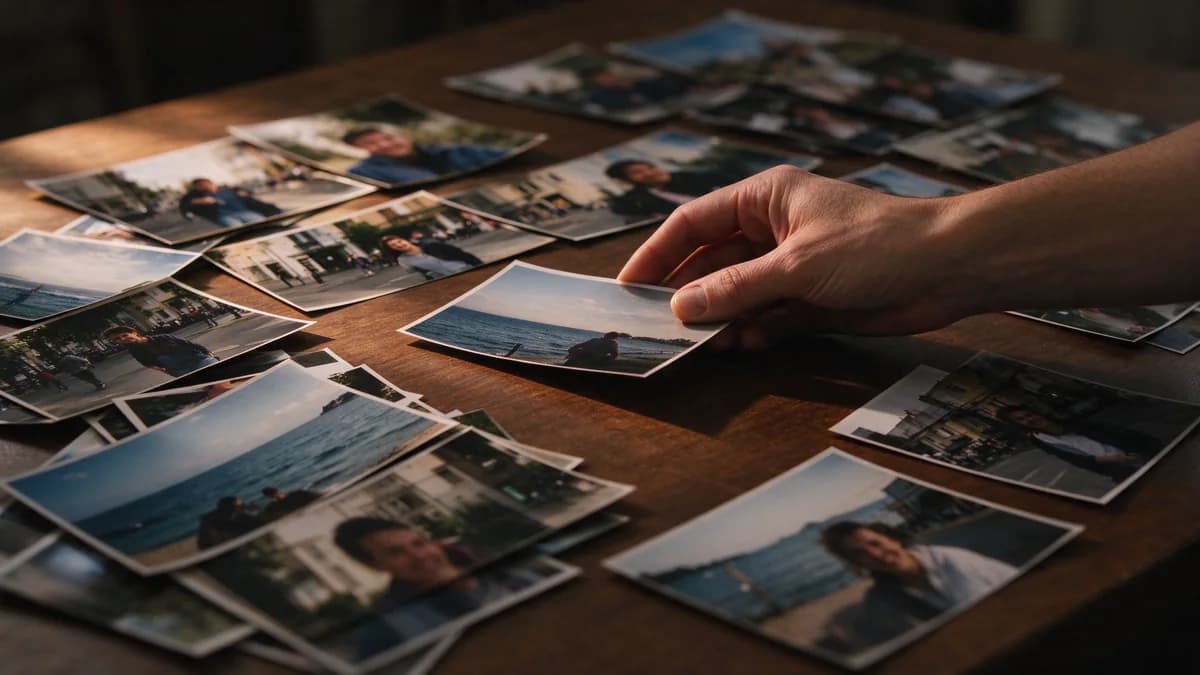
People sort photographs chronologically because that is how they were taken. Viewers do not experience a slideshow chronologically; they experience it as a rhythm. A chronological order tends to cluster — ten near-identical frames from the same minute, then a jump of six months — which produces long dull stretches punctuated by discontinuities.
Three passes fix this in about ten minutes:
- Kill duplicates first. Any two frames taken within the same minute by the same person are one frame. Pick the sharper one. This alone usually removes a third of the folder.
- Group by place, not by date. A kitchen, a beach, a street at night. Place groups read as scenes; date groups read as a filing cabinet.
- Alternate wide and close. A wide frame, then a face, then a wide, then a detail. The eye needs the change of scale more than it needs narrative logic.
Then place the one frame that hurts. Every good photo video has a single image that carries the emotional weight, and it should not be in the middle where attention dips. Put it about two-thirds in, at a point where the music has already established itself.
Transitions: use fewer than you want
The instinct is to disguise the fact that these are still images. That instinct is wrong. A hard cut between two photographs reads as confidence; a cross-dissolve reads as apology. Viewers accept cuts instantly, and they accept dissolves only when the two images share a composition.
The practical set is small:
- Hard cut for anything within the same scene. This should be 80% of your cuts.
- Short dissolve (0.3–0.5 s) only between two scenes, where the location changes.
- Movement-matched cut when one photo's subject faces left and the next faces right — cutting between them creates an implied eyeline and is the cheapest trick in the format.
- Nothing else. Wipes, page turns, spinning cubes and zoom blurs all announce the software that made them.
If a transition is doing work, it is because the two images do not belong next to each other. Move one of them.
Music is the timing grid, not the background
Choose the track before you place a single photo, because the track decides where the beats are and the beats decide where the cuts go.
Practical approach: find the first strong downbeat after the intro, and put your first photograph change there. Then cut on every second or fourth beat, not every beat — every beat is too fast for stills. A 100 BPM track gives you a change roughly every 2.4 seconds at the half-note, which lands neatly inside the 1.5–3.5 second window.
Two details that separate an amateur result from a professional one:
- Do not fade the music in over the first image. Start the track at full level on the first frame and let the image arrive with it.
- End on the image, not on the fade. Let the last photograph hold for four or five seconds with the music resolving under it. The fade-to-black after that can be half a second, not two.
Captions that do not fight the image
Photographs already carry their own hierarchy — a face, a horizon, a bright patch. Text placed on top competes with all three, and usually loses. Two placements survive: a caption in the lower third with a soft gradient behind it, or a caption that arrives on an empty area of the frame the photographer left alone.
Write captions as labels, not sentences. A place name, a date, a first name. Six words maximum, and one caption per scene rather than one per photograph — a caption on every frame turns the video into a spreadsheet. If a moment needs a full sentence to be understood, that is a sign the selection is wrong, not that the caption is too short.
Also decide early whether the video will be watched with sound off, which is the default on most feeds. If it will, the music is decorative and the captions carry the meaning; if it will not, keep the captions sparse and let the track do the emotional work. Trying to do both at full strength is what makes a photo video feel busy without being informative.
Cutting a vertical version without losing faces
If the photographs were shot horizontally — and most were — a 9:16 version is not a crop, it is a re-composition, and the crop has to be decided per image.
A centre crop is right when the subject is already central and there is headroom. It is wrong for almost everything else. Two rules cover most cases: keep the eyes on the upper third line, and never let the crop cut through a hand or a shoulder that the subject is leaning on. When a group photo cannot survive a 9:16 crop, the honest move is to show it letterboxed inside the vertical frame with a soft background fill, rather than to cut half the people out.
For a 16:9 or 1:1 version of the same film, do not rebuild it. Change the frame and re-check only the two or three images where the subject sat near the edge.

When one photograph should be animated instead
There is a fork in this workflow that most people take by accident. A folder of twenty photographs is a slideshow. A single photograph that you want to keep looking at is a different problem, and it is solved by animating the still rather than by holding it longer.
Holding a still for eight seconds does not make it feel alive; it makes the video feel stalled. If the frame has something that can plausibly move — hair, fabric, water, smoke, a light source, a distant crowd — animating that single image for five seconds gives you a shot that a slideshow cannot produce. The decision rule is simple: if the image has motion material in it, animate it; if it is architecture, text or a hard-edged product, hold it and cut on the beat.
That fork is covered in depth elsewhere on this site — the material-by-material breakdown lives in animate photos, and the single-photo path from upload to export is in photo to video for beginners. This article stays on the multi-photo side of the line.
Export settings that survive re-upload
The single most common reason a finished photo video looks worse on a phone than it did in the editor is a double compression: high bitrate export, then the platform re-encodes it at a lower one. Exporting slightly above the platform's own target reduces the damage.
| Setting | Vertical (9:16) | Landscape (16:9) |
|---|---|---|
| Resolution | 1080 × 1920 | 1920 × 1080 |
| Frame rate | 30 fps | 30 fps |
| Bitrate | 12–16 Mbps | 12–16 Mbps |
| Audio | 320 kbps AAC, 48 kHz | same |
| Colour | standard, not log | standard, not log |
Two habits worth keeping: never export a still image sequence as a GIF first (it quantises the colour and there is no going back), and keep one export at the source resolution as an archive even if you only publish the vertical cut.
A ten-minute build, end to end
- Count the folder, then decide the runtime. Write the target number of photos down before you start selecting.
- Delete duplicates and near-duplicates. This is the highest-value ten seconds of the whole job.
- Pick the track and find its first strong downbeat.
- Select and order the photographs in place-groups, alternating wide and close.
- Place the single strongest image at roughly two-thirds.
- Cut on every second or fourth beat, using hard cuts inside scenes.
- Crop per image for the vertical version; letterbox anything that cannot survive.
- Hold the final image for four or five seconds and let the music resolve.
- Export at the settings above and check it on a phone, not on the editing screen.
The whole thing is arithmetic plus selection. The arithmetic you can do in a table; the selection is the part that makes people watch to the end.
The checks in this article are easier to run than to describe: the image to video tool takes one still and returns a five-second clip, which is usually enough to see whether the frame holds up.