

Video Ad Maker: Building a Ten-Second Spot That Holds Attention
A ten-second video ad lives on its first nine frames and its last two seconds. Everything between them is a product shot and a single line of text — and the sequencing is what a video ad maker actually decides.
On this page
# Video Ad Maker: Building a Ten-Second Spot That Holds Attention
Every video ad maker eventually runs into the same hard constraint: a vertical spot has about nine frames to earn the next nine seconds. Everything after that is delivery. Not the product shot, not the music, not the logo — the first third of a second decides whether the rest is watched at all.
That is uncomfortable for anyone who came from longer formats, because in a thirty-second piece you can build. In a ten-second piece you cannot build. You have to arrive already interesting, and then spend the remaining time proving you were worth the stop. This article treats the ten-second vertical ad as a fixed structure with named parts, so the decisions stop being a matter of taste and start being a matter of sequence.
Why ten seconds, and why vertical
A ten-second spot is short enough to be watched in one go without a decision, and long enough to carry one product and one idea. That combination is rare. Below six seconds there is no room for a reason; above about fifteen there is room for a second idea, which is usually a mistake when you are shooting from a single photograph.
Vertical matters because the thumb is already there. A 9:16 frame occupies the whole of a phone screen, which means there is no competing content beside your ad and no forgiveness for empty space. Every pixel is either doing work or costing you.
The practical consequence: build the vertical version first and derive everything else from it. A landscape-first spot cut down to 9:16 loses its composition; a vertical spot letterboxed into 16:9 still reads, because the subject was already designed to fill the frame.
The four parts of a ten-second spot
| Time | Part | What it must accomplish | What goes wrong here |
|---|---|---|---|
| 0.0–0.3 s | The stop | One unmistakable visual event — motion, contrast, or an unexpected scale | A slow fade in, a logo, or a static packshot |
| 0.3–2.0 s | The problem | Show the situation the product belongs in, without narrating it | Explaining instead of showing |
| 2.0–7.0 s | The product | The product in the environment, doing what it is for | A white-background packshot that could belong to anything |
| 7.0–10.0 s | The ask | One line of text, one action, held long enough to read twice | Two CTAs, or a CTA that appears and vanishes in one second |
Read the table as a contract. If the first 0.3 seconds are not a visual event, nothing downstream matters, because there is no downstream.
The first nine frames
Twenty-five frames per second means nine frames is a little over a third of a second. In that window you cannot tell a story, but you can do one of three things that reliably stop a scroll:
Motion into frame. Something enters the frame fast and stops. A hand placing the product, a splash, a door opening. Motion that resolves in under half a second reads as an event; motion that continues past a second reads as footage.
Impossible scale. A product shot as a landscape — a bottle standing in a field, a shoe on a staircase of a building. The mismatch between object size and environment does the work.
A face, mid-expression. Not a smile into camera — that is a pose. A face caught reacting to something is the single strongest scroll-stopper available, and it costs nothing to make from a photograph.
What not to do in the first nine frames: a logo animation, a fade from black, a slow push in on a static product, or a title card. All four are conventions from television, and all four assume the viewer has already agreed to watch.
How many words actually fit
A vertical ad can carry roughly twelve to sixteen characters per line at a readable size, and two lines at a time. That is about five to seven words. Fewer if the product name is long.
Three rules that survive testing:
- One idea per text event. If a line needs a comma to make sense, it is two events.
- Text arrives after the image, not with it. Give the visual half a beat to land, then bring the words. Simultaneous arrival splits attention and both get missed.
- Hold each line for at least 1.2 seconds — the same threshold as a still image, because it is the same perceptual limit. Two seconds is comfortable. Three is generous and usually means the line was too long.

Assume the sound is off
Most vertical feeds start muted and stay muted unless something earns the unmute. A ten-second spot therefore has to work as a silent film first and as an audio piece second — which changes what the first second should contain, because a voiceover hook is invisible to a viewer who cannot hear it.
Practically: put the hook in the image, not in the audio. Let the music be a bed rather than information. If a line of dialogue or a voice is essential, caption it inside the safe area rather than relying on the track, and keep the caption short enough to read in the same two seconds the viewer would have spent listening.
The test is simple. Watch your own spot on a phone with the volume at zero and the screen at arm's length. If you cannot tell what is being sold and what to do next, the audio is carrying too much of the structure.
The subtitle safe area
Platforms overlay their own interface on top of your video: a caption, a handle, buttons down the right edge, a progress bar at the bottom. Those overlays sit in predictable places, and text placed there is invisible.
The usable zone on a 1080 × 1920 frame is roughly:
- Top: keep the upper 220 px free of critical text.
- Bottom: keep the lower 320 px free of critical text.
- Right: keep the rightmost 180 px free, all the way down.
That leaves a centre band of roughly 1080 × 1400 for content. Design to that band and the same export works on every vertical feed without per-platform editing.
Two consequences worth accepting up front: your product cannot sit at the bottom of the frame, and your call to action cannot sit at the bottom either. Put the CTA in the band, centred, and let it hold.
The call to action lands once
A ten-second ad gets one ask. Two asks reduce response to whichever was seen second, and the second is usually the weaker one.
Place it at seven seconds, hold it for two, and let the last second return to the product with no text at all. That final textless beat does something specific: it gives the viewer a moment to decide without being pushed, and it makes the ad re-watchable because the ending is clean.
The wording should be an action, not a benefit. "See how it works" outperforms "revolutionary technology" because one is something a person can do in the next second and the other is a claim they have to evaluate.
One asset, three sizes
Cut the vertical first, then derive. The order matters because cropping a 9:16 composition into 16:9 throws away the top and bottom that were carrying your safe area, whereas the reverse leaves you with a letterboxed strip.
| Format | Frame | What changes |
|---|---|---|
| 9:16 | 1080 × 1920 | The master. Everything is composed for this. |
| 1:1 | 1080 × 1080 | Re-centre on the product; the CTA moves up into the middle third. |
| 16:9 | 1920 × 1080 | Requires a wider source or a background extension; expect to reframe the product shot. |
The 1:1 version is nearly free if the vertical was composed with the subject centred. The 16:9 version is the one that costs real work, and the honest question is whether the placement needs it at all — a ten-second spot built around a phone screen rarely does.
Building one from a single photograph
The constraint most small teams face is not editing skill, it is that they have one good product photo and no shoot budget. That is workable, but only if the photograph was taken with motion in mind.
A still that animates well has three properties: the product sits in a real environment rather than on white, there is one clear light direction so surfaces have something to shift across, and the background is soft enough that movement behind the product does not compete. Given those, five seconds of slow motion — a drift of light, a curl of steam, a shadow shortening — is enough to give the packshot the thing it lacks, which is the sense that time is passing.
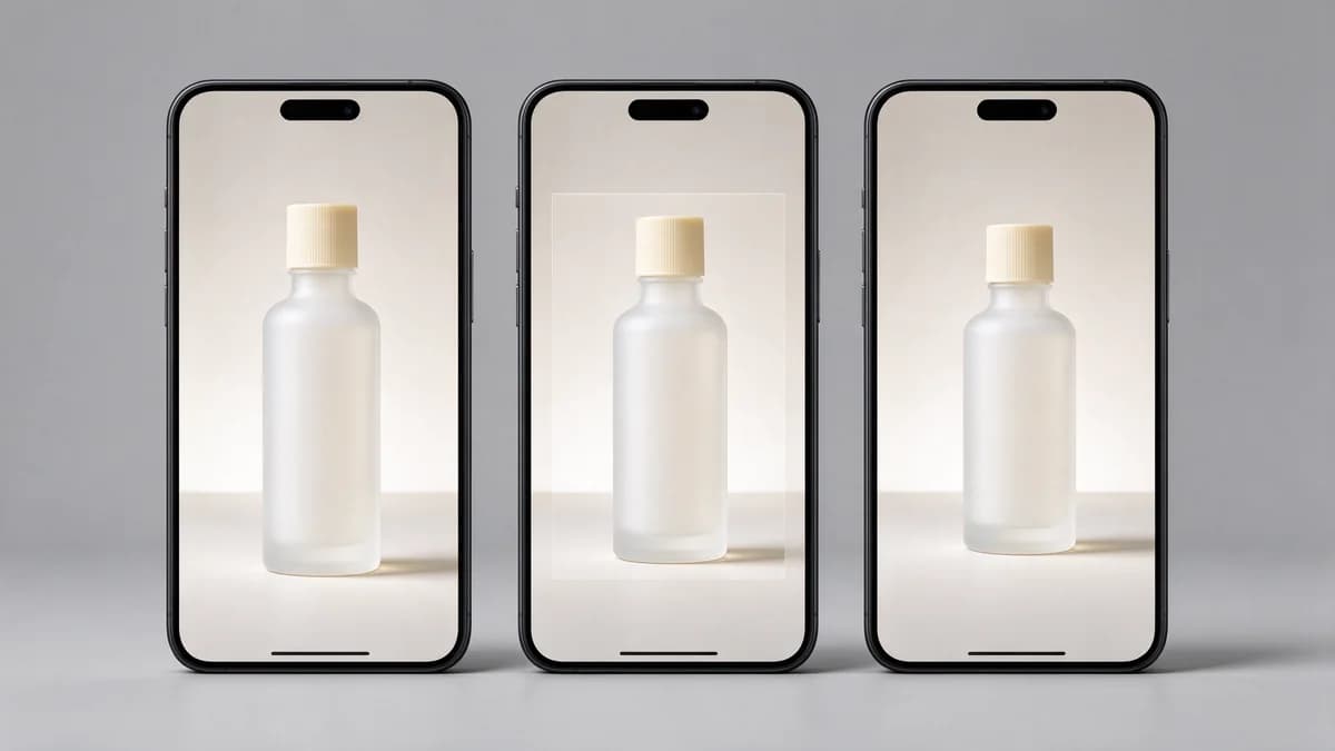
The rest of the structure is unchanged. The animated packshot still occupies the 2–7 second slot; the stop and the ask are still text and timing. Animation buys you a reason to keep looking, not a replacement for the sequence.
The checklist before you publish
- Does something happen in the first third of a second that is not a fade or a logo?
- Is there exactly one idea in the whole spot?
- Does every text event arrive after its image?
- Is every line held for at least 1.2 seconds?
- Is the centre band free of platform overlays top, bottom and right?
- Is there exactly one call to action, starting at seven seconds?
- Does the final second have no text on it?
- Does it still read with the sound off?
If all eight pass, the spot is structurally sound. Everything else — the grade, the track, the exact wording — is refinement on top of a structure that already works.
The checks in this article are easier to run than to describe: the image to video tool takes one still and returns a five-second clip, which is usually enough to see whether the frame holds up.